
Flutter 按钮类型和不推荐的按钮类型以及如何替换它们

前言
在本文中,我将分享如何在 Flutter 中使用按钮。我将详细讨论提升、概述、图标和文本按钮。我还添加了不推荐的按钮类型,以及它们如何转换为现有的内置按钮类型。在设计和开发 Flutter 应用程序 UI 时,了解所有这些类型的按钮非常重要。
正文
Elevated Button 按钮
在 Flutter,提升按钮只是一个内置的 widget 。具体来说,有按钮的形状和设计以及按下的功能。没什么特别的。
作为一个初学者,你知道该 center 目前正在覆盖整个屏幕区域。所以中间的东西都会在屏幕中央。在下面的示例中,我使用了一个子代来传递提升的、概述的、图标和文本按钮 widget 。
Center(

    child: ElevatedButton(

      onPressed: () {  },

      child: Text("Start Shopping"),

      style: ElevatedButton.styleFrom(

        padding: EdgeInsets.all(20.0),

        fixedSize: Size(300, 80),

        textStyle: TextStyle(fontSize: 25, fontWeight: FontWeight.bold),

        primary: Colors.blue,

        onPrimary: Colors.black45,

        elevation: 15,

        shadowColor: Colors.lightBlue,

        side: BorderSide(color: Colors.black45, width: 2)

      ),

    )

  ),
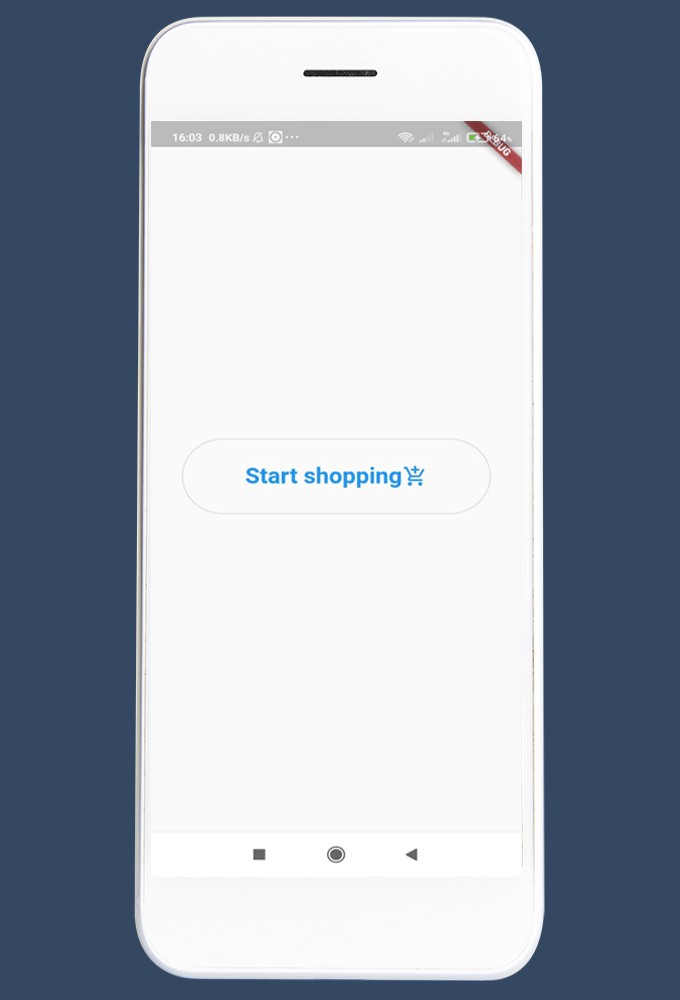
我在一个 Center widget 中包装了 ElevatedButton widget ,并将其设置为脚手架 widget 的主体。必须提到 Onpress() 和 child() 属性。您可以根据需要使用其他属性。这是输出。

可以通过在样式中添加称为形状的属性来更改此按钮的形状。您可以选择按钮形状为圆形、矩形、圆角矩形、体育场边框或任何您喜欢的形状。
此外,您还可以在提升的按钮上添加一个图标,从而为用户提供更多的信息和吸引力。
Center(

        child: Directionality(

          textDirection: TextDirection.rtl,

          child: ElevatedButton.icon(

              icon: Icon(Icons.add_shopping_cart_outlined),

              label: Text("Start Shopping"),

              onPressed: () {},

              style: ElevatedButton.styleFrom(

                  padding: EdgeInsets.all(20),

                  fixedSize: Size(300, 80),

                  textStyle: TextStyle(

                    fontSize: 25,

                    fontWeight: FontWeight.bold,

                  ),

                  elevation: 15,

                  shadowColor: Colors.blue,

                  side: BorderSide(color: Colors.black87, width: 2),

                  alignment: Alignment.center,

                  shape: StadiumBorder())),

        ),

      ),

Outlined Button 带轮扣按钮
第二种按钮类型是轮廓按钮。它没有改变太多,从提高按钮。但在默认情况下,有一个非常轻的边界,没有高度,文本居中。同样,我们可以使用带有图标的大纲按钮,如下面的示例所示。
Center(

        child: OutlinedButton(

            child: Row(

              mainAxisAlignment: MainAxisAlignment.center,

              children: [

                Text("Start shopping"),

                Icon(Icons.add_shopping_cart_outlined),

              ],

            ),

            onPressed: () {},

            style: ElevatedButton.styleFrom(

                padding: EdgeInsets.all(20),

                fixedSize: Size(300, 80),

                textStyle: TextStyle(

                  fontSize: 25,

                  fontWeight: FontWeight.bold,

                ),

                shadowColor: Colors.blue,

                shape: StadiumBorder())),

      ),
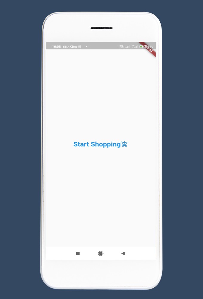
这是输出。
Text Button 文字按钮
在文本按钮中,没有均匀的光线边框,只有可点击的文本。我们可以点击整个按钮区域,不仅仅是文本。还可以用按钮添加图标。这里有一个尝试自己的例子。
Center(

        child: TextButton(

            child: Row(

              mainAxisAlignment: MainAxisAlignment.center,

              children: [

                Text("Start Shopping"),

                Icon(Icons.add_shopping_cart_outlined),

              ],

            ),

            onPressed: () {},

            style: ElevatedButton.styleFrom(

                padding: EdgeInsets.all(20),

                fixedSize: Size(300, 80),

                textStyle: TextStyle(

                  fontSize: 25,

                  fontWeight: FontWeight.bold,

                ),

                shadowColor: Colors.blue,

                shape: StadiumBorder())),

      ),
这是输出。
转换 Flat Buttons 到 Text Buttons
当你打算更新你的旧 Flutter 项目,你可以看到扁平按钮是不推荐的。“平按钮已废弃,不应使用”所以我们需要用一个文本按钮替换它。不仅文本按钮,但我们也可以转换成任何其他按钮类型。我们只需要考虑如何根据需要更改 widget 的属性。
我们可以在将平面按钮转换为文本按钮时更改选定的属性,而不是更改所有属性。在文本按钮中,有属性样式。在这个属性中,我们可以定义 textStyle 属性。因此,我们可以删除的属性,我们定义在平面按钮,如填充,颜色,形状等。
像这样,你可以看到 raised button 按钮也死了。它还需要被任何其他按钮类型替换。
Icon Button 图标按钮
您可以简单地添加以下四个属性并启动一个图标按钮。你可以用一个 container 来装饰按钮。
Center(

        child: Container(

          height: 70,

          width: 70,

          decoration: BoxDecoration(

            border: Border.all(

            ),

            shape: BoxShape.circle,

            color: Colors.blue,

          ),

          child: IconButton(

            icon: Icon(Icons.shopping_cart_checkout_outlined),

            iconSize: 50,

            tooltip: "Start Shopping",

            onPressed: (() {

            }),

          ),

        ),

    ),
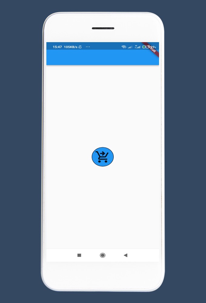
在这里您可以看到输出,并且可以进行许多自定义。
结束语
如果本文对你有帮助,请转发让更多的朋友阅读。
也许这个操作只要你 3 秒钟,对我来说是一个激励,感谢。
祝你有一个美好的一天~
© 猫哥
微信 ducafecat
https://wiki.ducafecat.tech
https://ducafecat.com