输入框 TextField
TextField用于文本输入, 有着丰富的属性,定义如下。
定义
const TextField({
Key? key,
// 控制器
this.controller,
// 焦点管理
this.focusNode,
// 装饰器 背景 颜色 边框 ...
this.decoration = const InputDecoration(),
// 键盘输入类型
// text 文本输入键盘
// multiline 多行文本,需和maxLines配合使用(设为null或大于1)
// number 数字;会弹出数字键盘
// phone 优化后的电话号码输入键盘;会弹出数字键盘并显示“* #”
// datetime 优化后的日期输入键盘;Android上会显示“: -”
// emailAddress 优化后的电子邮件地址;会显示“@ .”
// url 优化后的url输入键盘; 会显示“/ .”
TextInputType? keyboardType,
// 键盘动作按钮图标
// TextInputAction.search 搜索
this.textInputAction,
this.textCapitalization = TextCapitalization.none,
// 正在编辑的文本样式
this.style,
this.strutStyle,
// 输入框内编辑文本在水平方向的对齐方式
this.textAlign = TextAlign.start,
this.textAlignVertical,
// 文字反向
this.textDirection,
// 只读
this.readOnly = false,
ToolbarOptions? toolbarOptions,
// 显示光标
this.showCursor,
// 自动焦点
this.autofocus = false,
// 密文显示
this.obscuringCharacter = '•',
this.obscureText = false,
this.autocorrect = true,
SmartDashesType? smartDashesType,
SmartQuotesType? smartQuotesType,
// 启用提示
this.enableSuggestions = true,
// 输入框的最大行数,默认为1;如果为null,则无行数限制。
this.maxLines = 1,
this.minLines,
this.expands = false,
// 代表输入框文本的最大长度,设置后输入框右下角会显示输入的文本计数。
this.maxLength,
(
'Use maxLengthEnforcement parameter which provides more specific '
'behavior related to the maxLength limit. '
'This feature was deprecated after v1.25.0-5.0.pre.',
)
this.maxLengthEnforced = true,
this.maxLengthEnforcement,
// 输入框内容改变时的回调函数;注:内容改变事件也可以通过controller来监听。
this.onChanged,
// 编辑完成
this.onEditingComplete,
// 确认输入内容
this.onSubmitted,
this.onAppPrivateCommand,
// 指定输入格式;当用户输入内容改变时,会根据指定的格式来校验。
this.inputFormatters,
// 如果为false,则输入框会被禁用,禁用状态不接收输入和事件,同时显示禁用态样式(在其decoration中定义)。
this.enabled,
// 光标样式
// 自定义输入框光标宽度、圆角和颜色
this.cursorWidth = 2.0,
this.cursorHeight,
this.cursorRadius,
this.cursorColor,
this.selectionHeightStyle = ui.BoxHeightStyle.tight,
this.selectionWidthStyle = ui.BoxWidthStyle.tight,
this.keyboardAppearance,
this.scrollPadding = const EdgeInsets.all(20.0),
this.dragStartBehavior = DragStartBehavior.start,
this.enableInteractiveSelection = true,
this.selectionControls,
// 点击
this.onTap,
// 鼠标
this.mouseCursor,
this.buildCounter,
this.scrollController,
this.scrollPhysics,
this.autofillHints = const <String>[],
this.clipBehavior = Clip.hardEdge,
this.restorationId,
this.enableIMEPersonalizedLearning = true,
})
示例
代码
import 'package:flutter/material.dart';
class InputPage extends StatefulWidget {
const InputPage({Key? key}) : super(key: key);
State<InputPage> createState() => _InputPageState();
}
class _InputPageState extends State<InputPage> {
// 文本消息
String _message = "";
// 输入框控制器
final TextEditingController _controllerName = TextEditingController();
final TextEditingController _controllerPassword = TextEditingController();
// 管理焦点
FocusNode focusNodeName = FocusNode();
FocusNode focusNodePassword = FocusNode();
FocusScopeNode? focusScopeNode;
// 输入框 - 用户名
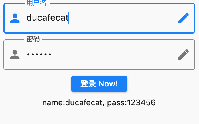
Widget _buildName() {
return TextField(
// 控制器
controller: _controllerName,
// 焦点
autofocus: true,
// 焦点管理
focusNode: focusNodeName,
// 输入框的样式
decoration: const InputDecoration(
labelText: '用户名',
hintText: '请输入',
prefixIcon: Icon(Icons.person),
suffixIcon: Icon(Icons.edit),
border: OutlineInputBorder(),
),
// 输入改变事件
onChanged: (String value) {
setState(() {
_message = value;
});
},
// 提交回车事件
onSubmitted: (String value) {
focusScopeNode ??= FocusScope.of(context);
focusScopeNode?.requestFocus(focusNodePassword);
},
);
}
// 输入框 - 密码
Widget _buildPassword() {
return TextField(
controller: _controllerPassword,
// 密码显示
obscureText: true,
// 焦点管理
focusNode: focusNodePassword,
// 输入框的样式
decoration: const InputDecoration(
labelText: '密码',
hintText: '请输入',
prefixIcon: Icon(Icons.person),
suffixIcon: Icon(Icons.edit),
border: OutlineInputBorder(),
),
);
}
// 按钮
Widget _buildButton() {
return ElevatedButton(
child: const Text('登录 Now!'),
onPressed: () {
setState(() {
_message =
'name:${_controllerName.text}, pass:${_controllerPassword.text}';
});
},
);
}
// 显示
Widget _buildMessage() {
return Text(_message);
}
void dispose() {
// 释放控制器
_controllerName.dispose();
_controllerPassword.dispose();
super.dispose();
}
Widget build(BuildContext context) {
return Scaffold(
body: Padding(
padding: const EdgeInsets.all(8.0),
child: Column(
children: [
_buildName(),
const SizedBox(height: 10),
_buildPassword(),
const SizedBox(height: 10),
_buildButton(),
const SizedBox(height: 10),
_buildMessage(),
],
),
),
);
}
}
输出