
按钮 Button
ElevatedButton
定义
  const ElevatedButton({
    Key? key,
    // 点击事件
    required VoidCallback? onPressed,
    // 长按
    VoidCallback? onLongPress,
    // hover
    ValueChanged<bool>? onHover,
    ValueChanged<bool>? onFocusChange,

    // 样式
    ButtonStyle? style,

    // 焦点
    FocusNode? focusNode,
    bool autofocus = false,
    Clip clipBehavior = Clip.none,

    // 按钮内容
    required Widget? child,
  })
ButtonStyle 样式定义
class ButtonStyle with Diagnosticable {
  /// Create a [ButtonStyle].
  const ButtonStyle({
    // 文字
    this.textStyle,
    // 背景色
    this.backgroundColor,
    // 前景色
    this.foregroundColor,
    // 鼠标滑过颜色
    this.overlayColor,
    // 阴影
    this.shadowColor,
    // 阴影高度
    this.elevation,
    // 内边距
    this.padding,
    // 最小尺寸
    this.minimumSize,
		// 固定 size
    this.fixedSize,
    // 最大最小尺寸
    this.maximumSize,
    // 边框
    this.side,
    // 形状
    this.shape,
    // 鼠标光标
    this.mouseCursor,
    // 紧凑程度
    this.visualDensity,
    // 配置可以按下按钮的区域的尺寸
    this.tapTargetSize,
    // 定义 [shape] 和 [elevation] 的动画更改的持续时间
    this.animationDuration,
    // 检测到的手势是否应该提供声音和/或触觉反馈
    this.enableFeedback,
    // 子元素对齐方式
    this.alignment,
    // 墨水效果
    this.splashFactory,
  });
代码
import 'package:flutter/material.dart';
class ButtonPage extends StatelessWidget {
const ButtonPage({Key? key}) : super(key: key);
Widget build(BuildContext context) {
return Scaffold(
body: Center(
child: Column(
mainAxisAlignment: MainAxisAlignment.center,
children: [
// ElevatedButton
ElevatedButton(
onPressed: () {},
child: const Text('ElevatedButton'),
style: ButtonStyle(
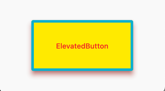
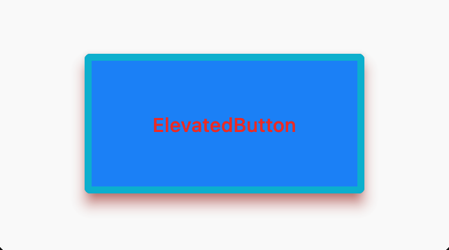
// 背景色
backgroundColor: MaterialStateProperty.all(Colors.yellow),
// 前景色
foregroundColor: MaterialStateProperty.all(Colors.red),
// 鼠标滑过颜色
overlayColor: MaterialStateProperty.all(Colors.blue),
// 阴影颜色
shadowColor: MaterialStateProperty.all(Colors.red),
// 阴影高度
elevation: MaterialStateProperty.all(8),
// 边框
side: MaterialStateProperty.all(const BorderSide(
width: 5,
color: Colors.cyan,
)),
// 固定尺寸
fixedSize: MaterialStateProperty.all(const Size(200, 100)),
),
),
],
),
),
);
}
}
输出
其它按钮
- TextButton 文字按钮
- OutlinedButton 边框按钮
- IconButton 图标按钮
代码
import 'package:flutter/material.dart';
class ButtonPage extends StatelessWidget {
const ButtonPage({Key? key}) : super(key: key);
Widget build(BuildContext context) {
return Scaffold(
body: Center(
child: Column(
mainAxisAlignment: MainAxisAlignment.center,
children: [
// 文字按钮
TextButton(
onPressed: () {},
child: const Text('TextButton'),
),
// 边框按钮
OutlinedButton(
onPressed: () {},
child: const Text('OutlinedButton'),
),
// 图标按钮
IconButton(
onPressed: () {},
icon: const Icon(
Icons.holiday_village,
),
iconSize: 50,
color: Colors.amber,
),
// 带图标 TextButton
TextButton.icon(
onPressed: () {},
icon: const Icon(Icons.holiday_village),
label: const Text('带图标 TextButton'),
),
// 带图标 OutlinedButton
OutlinedButton.icon(
onPressed: () {},
icon: const Icon(Icons.holiday_village),
label: const Text('带图标 OutlinedButton'),
),
],
),
),
);
}
}
注意
TextButton.iconOutlinedButton.icon可以输出带图标文字的按钮
输出
